Beginning Digital Arts
Wednesday, May 7, 2014
Magazine
This is a travel magazine I came up with. I really enjoy traveling and have been to around 13 different countries. The ad I made as the back is about a fictional vineyard but the picture is one I took in Tuscany when I stayed and worked on a vineyard for a month. The front page is a picture of the Eiffel Tower with the south African Flag's colors that I took when I was in Paris last summer.
Rotoscoping
Wednesday, April 9, 2014
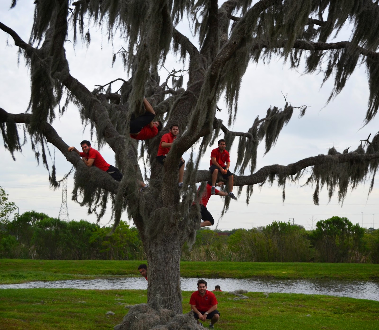
Multiplicity
This assignment was to add ourselves into the same photograph in different positions/locations. It was pretty fun, especially taking the pictures since that is something I really enjoy. Climbing the tree was fun too. Except for the scratch on my leg, but that's the hazards of art. The multiplying of bodies was pretty easy, I just had to mess around with a few things to make everything look right. All in all, it was a pretty easy and fun project to do, with minimal injuries.
Wednesday, April 2, 2014
Photoshop Retouch
This is a retouch of an old family photograph containing my grandpa and great grandparents. I touched it up using the clone stamp tool, the spot healing tool, the patch tool, changing the levels, and a few other things.
Wednesday, March 19, 2014
Constructivist Propaganda

This was a fun assignment. I did 2 posters because one was just a fun idea and the other was a serious controversial issue, but I like both of them. I believe medical marijuana should be legal in every state because it is a very useful medicine for many different ailments, which I showed in my poster. It helps almost any issue you can think of and it would be very beneficial for things like cancer and AIDS especially, since patients with these diseases often have trouble eating, which the marijuana helps with. I believe a major reason people are "afraid" of medical marijuana is because they are misinformed about what it can do. Also, lobbying by big pharmaceutical companies that don't want competition is part of the reason it isn't more prevalent as of right now.
As for the ostrich, I do have reasoning behind the poster and my hate for them. I was volunteering at a zoo and there was an ostrich in one of the enclosures next to one I was cleaning. When I was done cleaning my enclosure, I wanted to walk through where the ostrich was to get out, but it was blocking the gate. Any time I would move, it would follow me and prevent me from leaving. It would taunt me and just keep following me, not letting me get anywhere. I couldn't get out until the manager eventually came over and got the ostrich to leave me alone. It's a simple poster but it conveys how I feel about them in a way that I feel is adequate.
Wednesday, February 26, 2014
Logos
I enjoyed this project. It was fun coming up with the different companies and thinking of unique ways to show what they do in their logo. I struggled a little with certain parts of the project but was eventually able to figure everything out and get it all together.
Wednesday, February 12, 2014
Calligram
This is a calligram of a bicycle. I enjoy riding my bike and do it for exercise and a way to escape. The process of making this calligram was frustrating but it eventually came together. I originally planned on doing a train to signify my passion for traveling, but after hours and hours of work trying to make it look good, I couldn't get it right and decided to go in a different direction. I feel that this bike came out pretty good and I am satisfied with the result. Although it was a simple design, I think I made it interesting to the eye and feel that while it could always use improvement, it was an effective design.
Subscribe to:
Comments (Atom)


